an illustration set that explains the product before anyone reads a word.
illustration · ongoing
client
OneTap Check-In
role
Illustrator
timeline
2021 to now, ongoing
scope
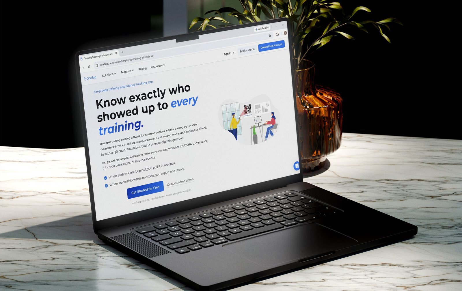
Illustration set for website, App Store and app
audience
Gyms, schools, universities, churches, job sites
01 brief
OneTap needed illustrations for its website, App Store listing and app.
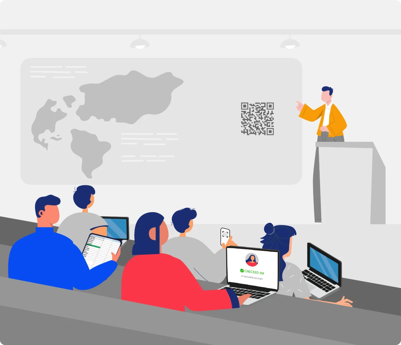
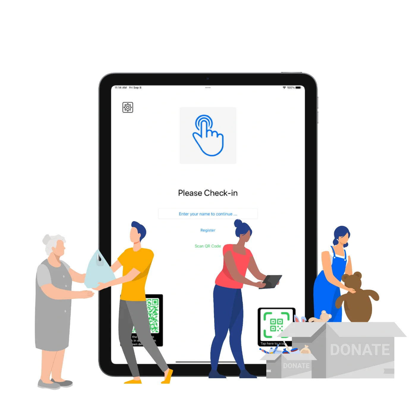
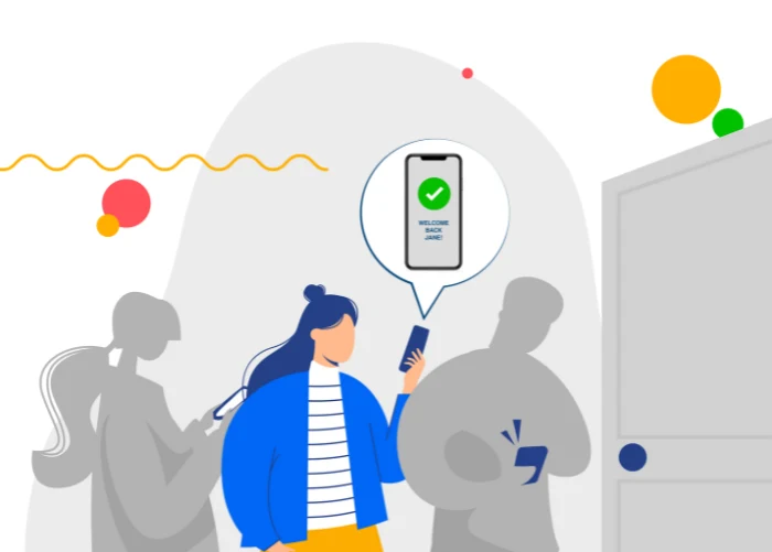
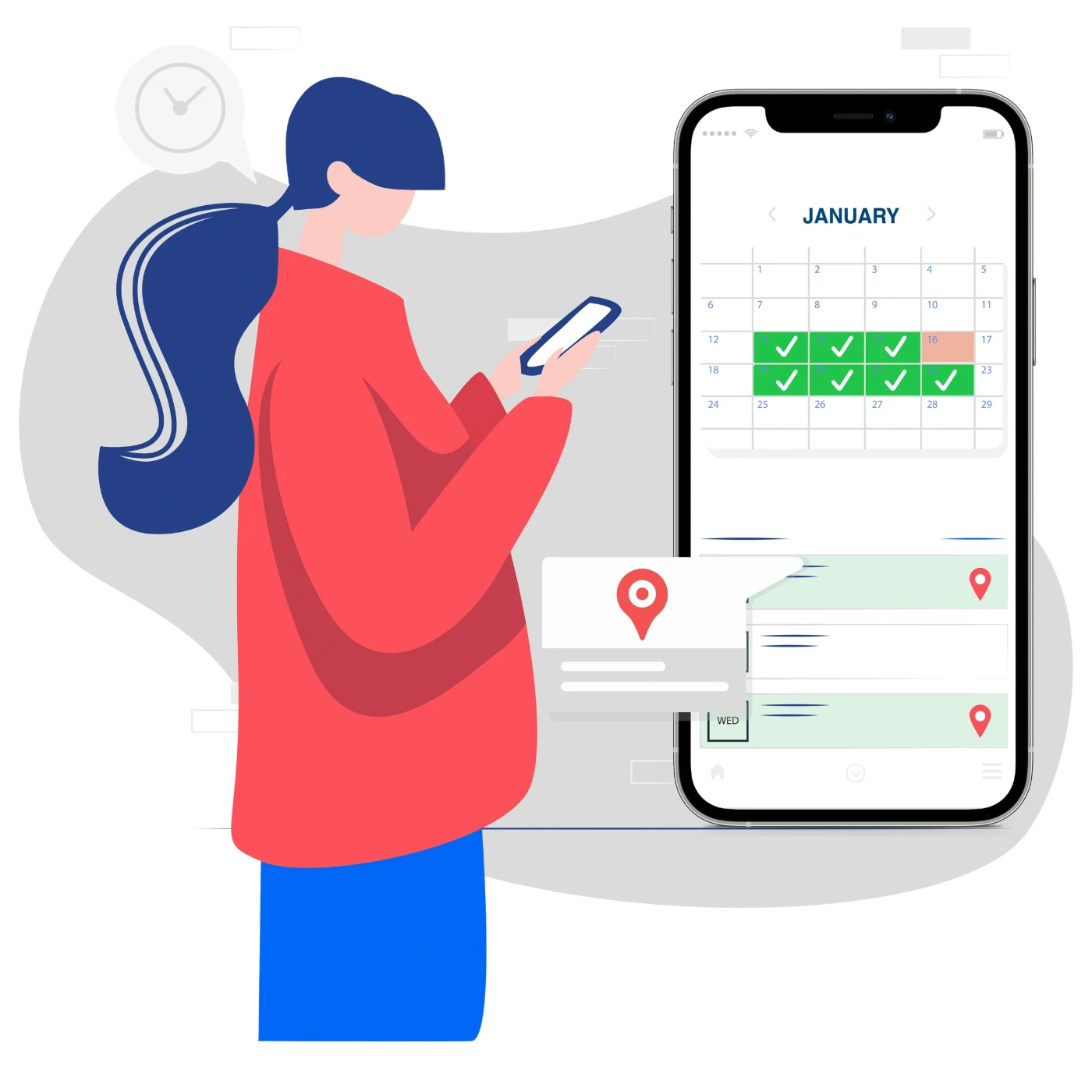
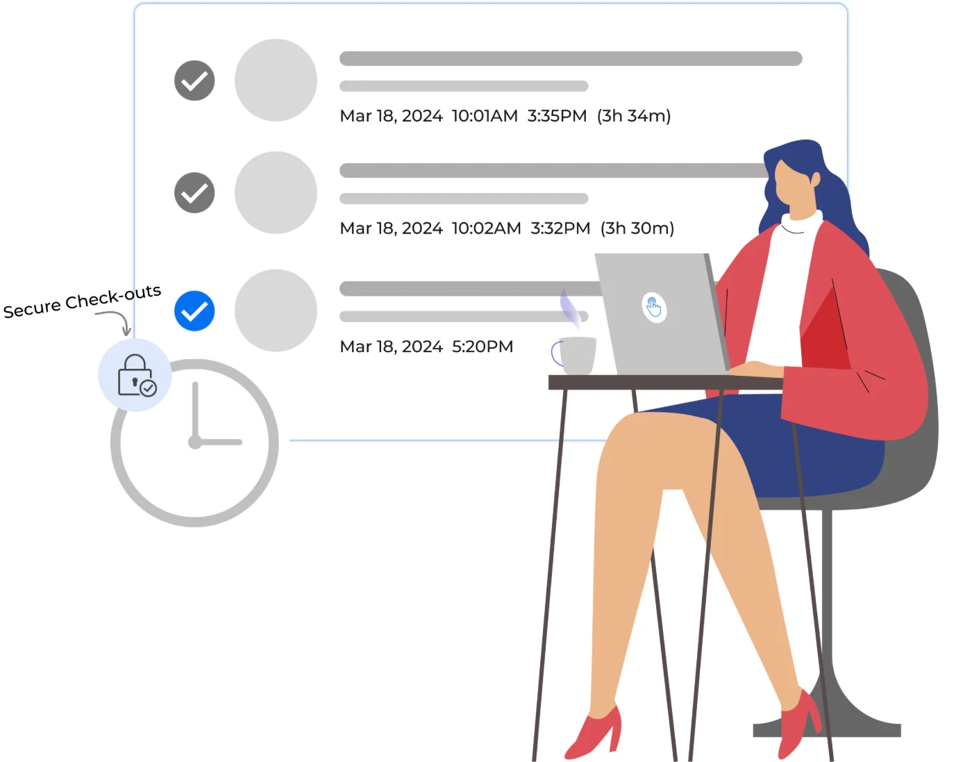
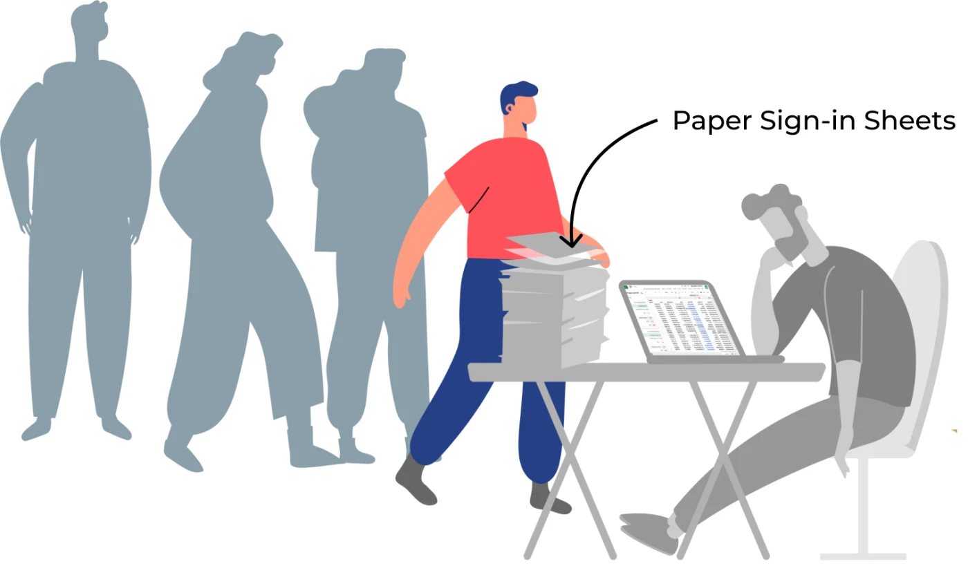
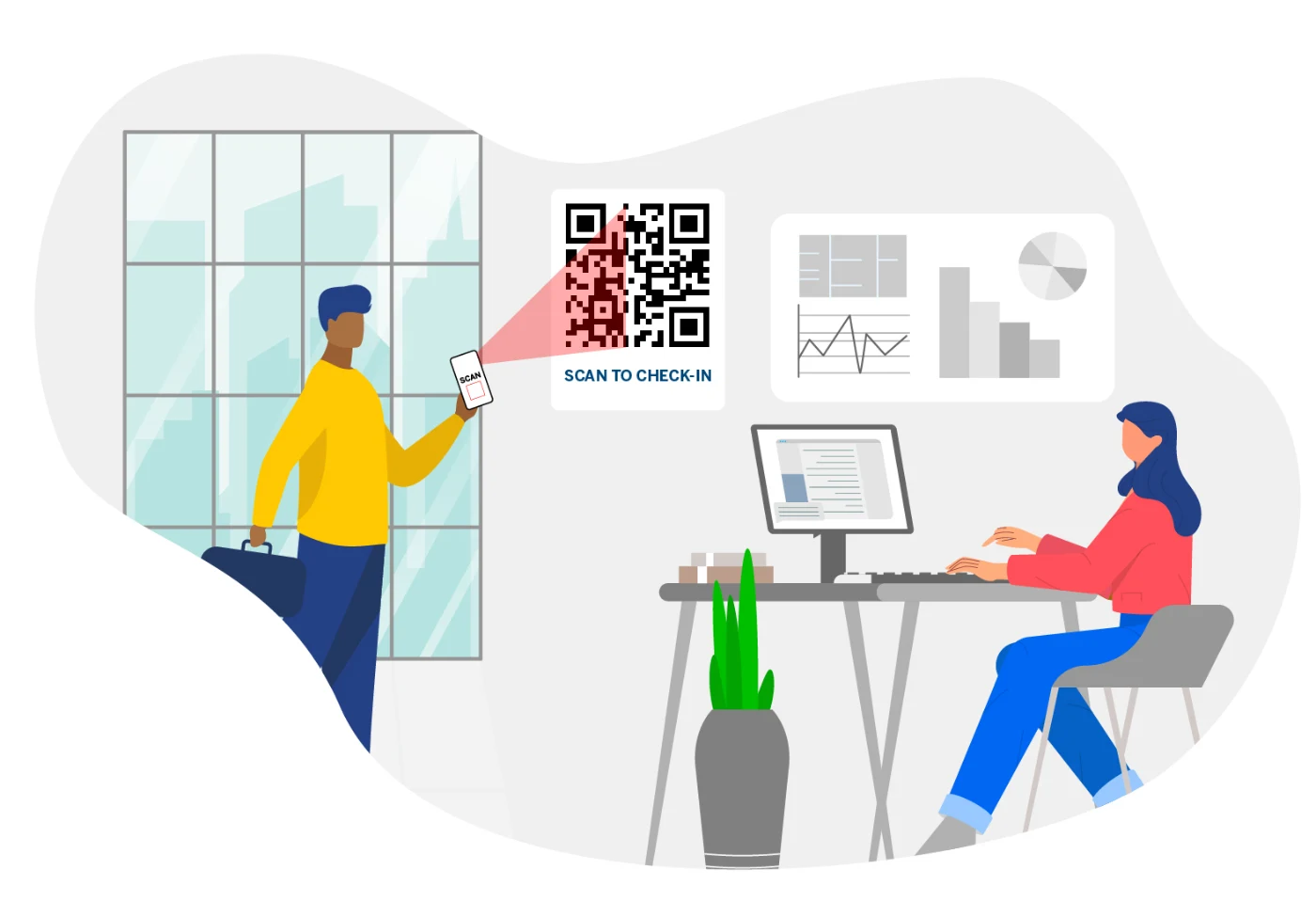
The goal was assets that explain the text, so visitors and app users get a better idea of each feature at a glance: touchless check-ins, QR codes, alerts and Excel imports.
02 audience
OneTap serves sports teams, K-12 schools, universities like UCLA, gyms, churches and construction sites.
That ruled out anything too playful for a job site or too corporate for a school. The illustrations needed to feel friendly for everyone while staying simple.
03 style
I built the set on OneTap’s colour scheme and kept it flat, so it sits naturally next to real app screens.
Each scene pairs a person with one feature, drawing on existing and new sources of inspiration, so the action reads instantly even at App Store thumbnail size.
colour palette · from the OneTap brand guidelines
The palette came straight from OneTap's brand guidelines: two warm tones and one cool, with a soft grey to hold every scene together.
04 work
The same illustrations run across the website, the App Store listing and inside the app, so the product looks and feels the same wherever someone meets it.
Every scene was drawn to be reused and cropped, from wide website banners to narrow phone screenshots.
place 1websiteFeature explainers next to the copy
place 2app storeScreenshots that sell the feature
place 3in-appMoments that guide new users
8 more scenes from the setlive on onetapcheckin.com
05 outcome
The set shipped across the website, App Store and app. OneTap’s website alone drew 186,000 visitors in a year, so the illustrations became the first thing a large audience saw of the product. OneTap still brings me back for new assets as the product grows.
[Add what you learned, and one thing you would do differently today.]
186kwebsite visitors in a year
3places the set appears
6audiences, one visual style
“Looks nice, very well thought out.”
Karsh, OneTap Check-In
06 still growing
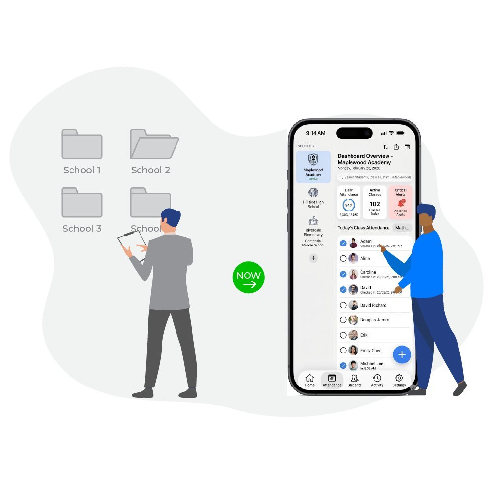
In 2026 OneTap came back with a new audience: school districts. OneTap’s team wrote a brief for each asset, pairing one district pain point with one product promise.
My job was turning each brief into a scene that reads in a second. The before is grey and stuck, the after is in colour and calm, and a green “now” marks the switch. The newer scenes put real dashboard screens in the characters’ hands, so the product itself is the proof.
Toronto, Ontario, Canada
M.A. Graphic Design
B.A. (Hons.) History
© Diljeet Kaur · designed by diljeet kaur