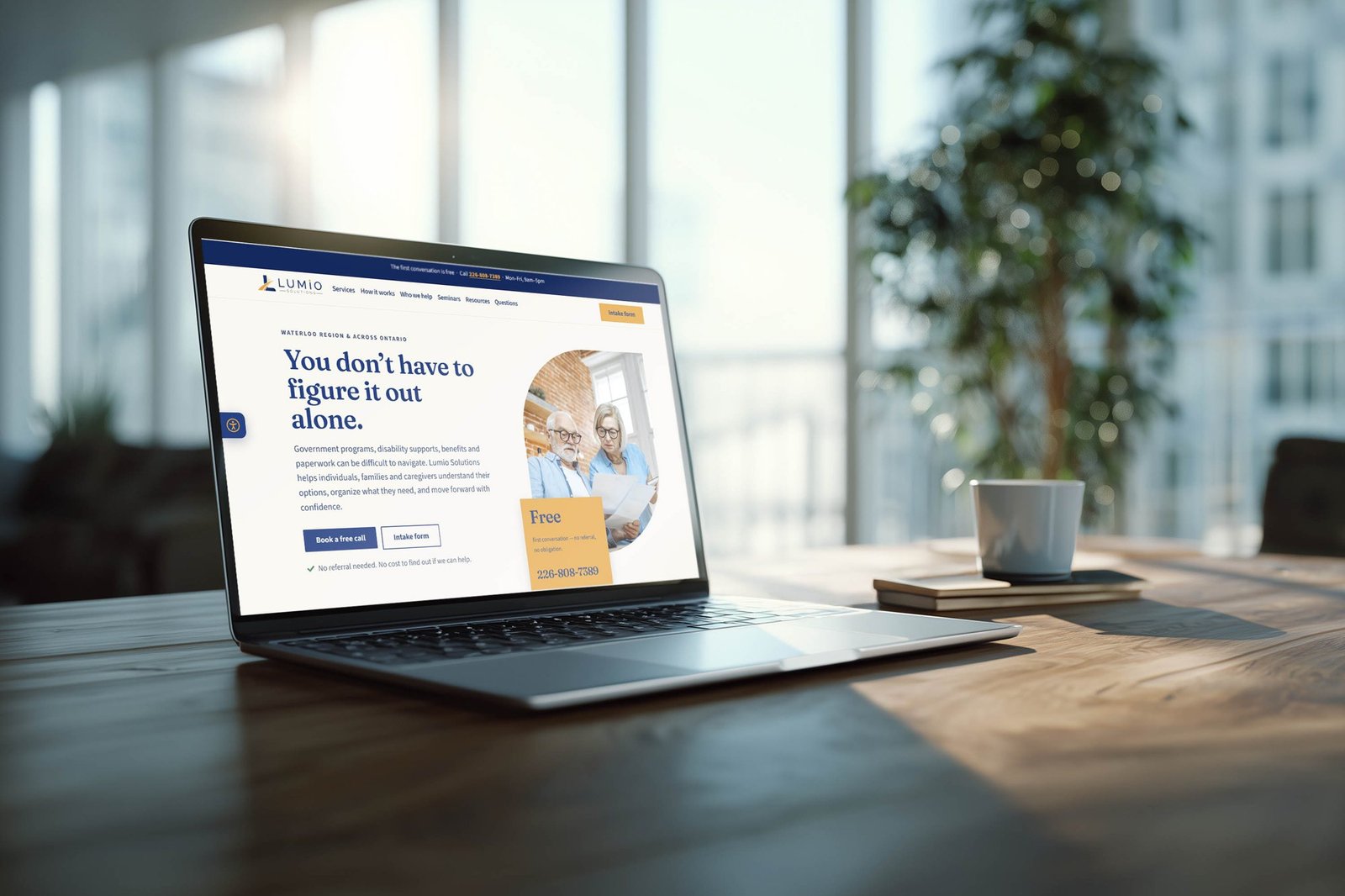
a website for people who find forms hard, built so asking for help is the easy part.
the oho studio · 2026
client
Lumio Solutions, Ontario
role
Strategy and design lead, The Oho Studio
timeline
2 weeks, 2026
scope
Strategy, UX, design and a custom WordPress build
outcome
Launched for a grant pitch, decision pending
01 brief
people who struggle with forms were being handed a website that felt like one.
Lumio Solutions helps people complete complicated government forms. Their clients are mostly older adults, caregivers and people with disabilities, for whom paperwork is a real barrier.
Lumio asked for a more visual site that was easier to navigate. What they needed was a site built around one question: what is someone thinking when they first find Lumio? Success meant understanding how Lumio helps, and how to reach them, right away.
4,377words on the old home page
66headings to scroll past
13links that went nowhere
0photos of real people
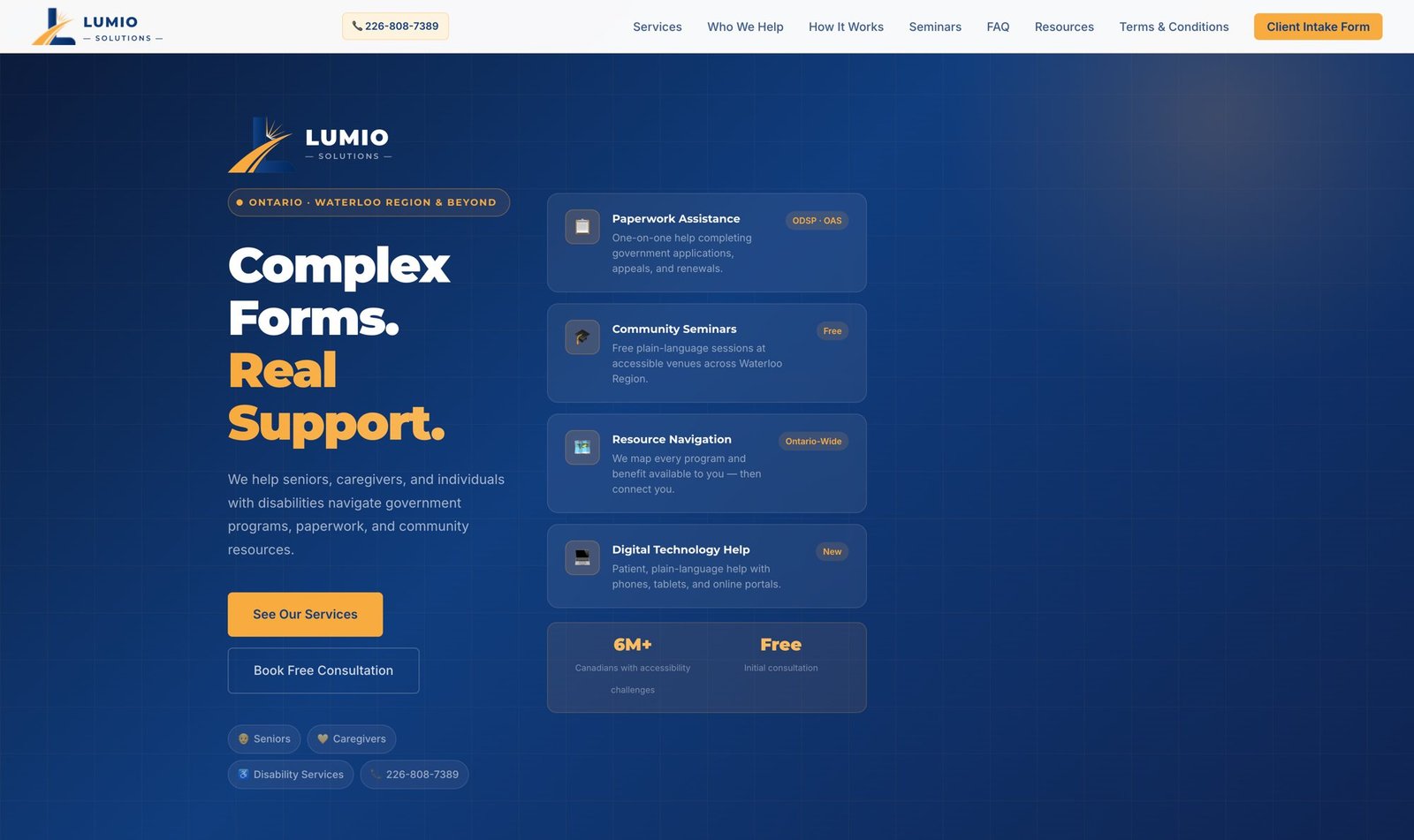
before | four boxes and two stats compete for attention
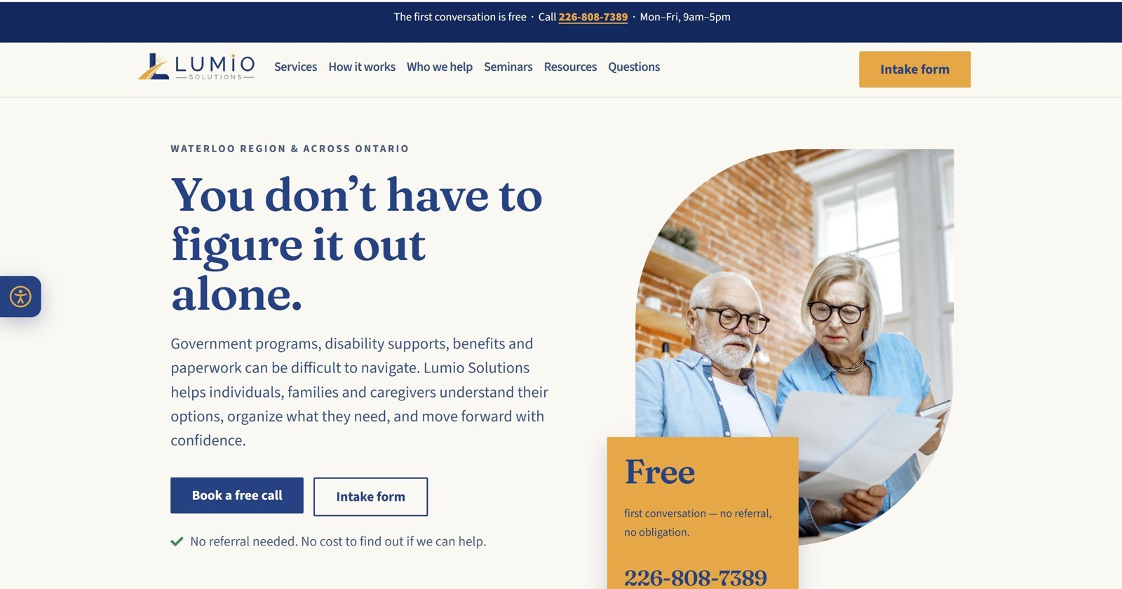
after | who it's for and how to call, first
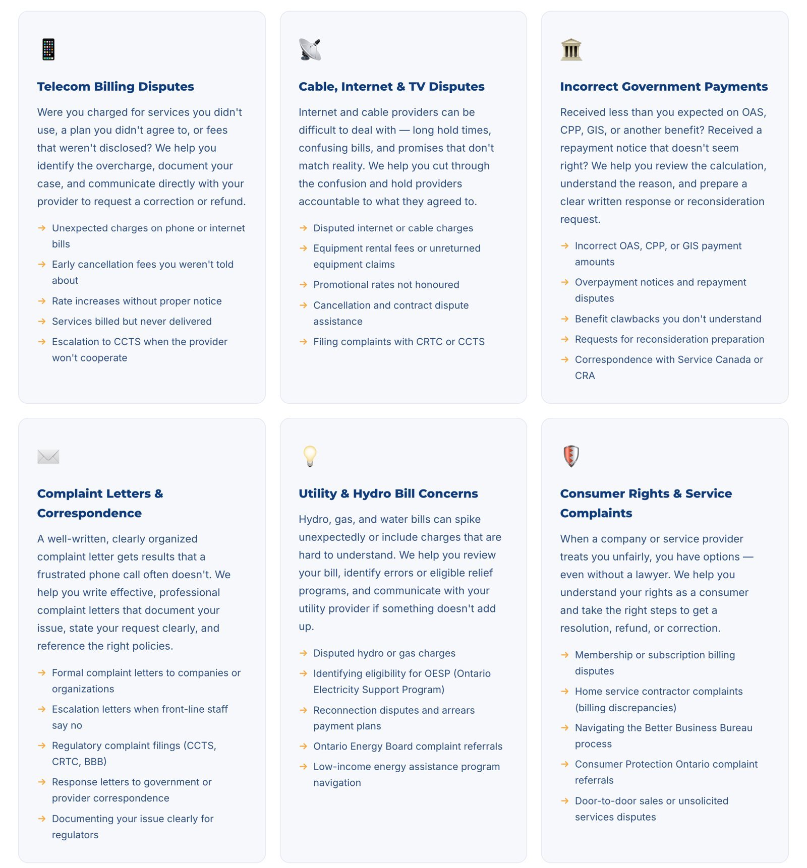
before | every service: a paragraph and five bullets
after | every service: one line, in the client's words
The old site was one hand-coded page. Services, story, advocacy, seminars and FAQ all lived on the home page, with emoji where photos should be. The intake form in the menu didn’t exist, and every small change needed a developer. For someone who already finds paperwork hard, the site itself had become paperwork.
02 constraint
every extra paragraph was one more obstacle.
For this audience, reading is the barrier. That ruled out explaining services in long blocks of text.
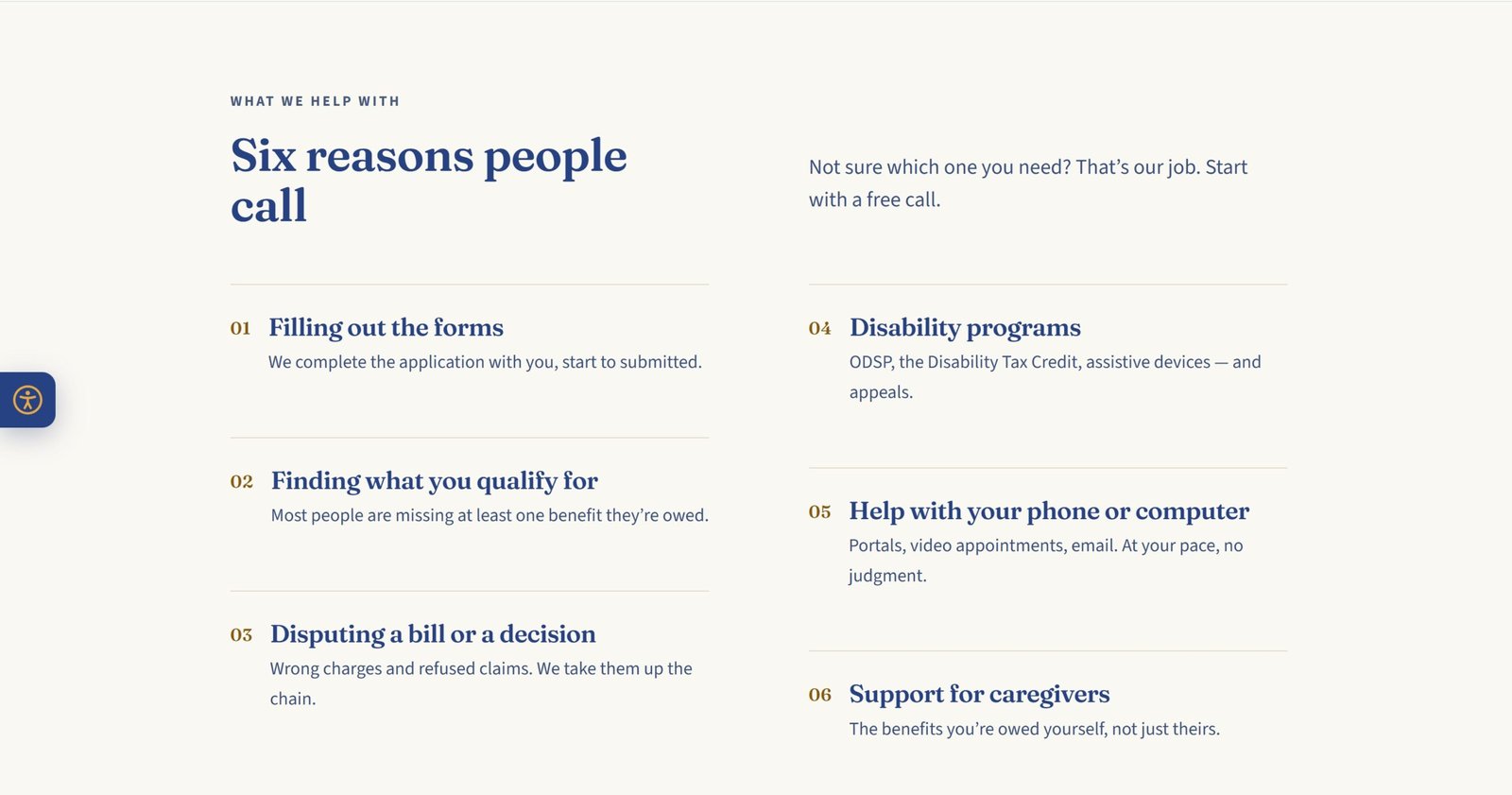
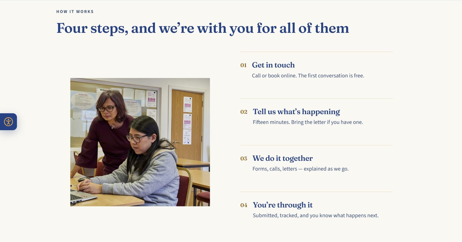
So the explaining moved into short lines in the client’s own words, numbered steps and clear buttons. Nobody has to translate their problem into service names.
process | four steps and a real time estimate
03 decision
three directions, one small budget.
A fully interactive site would have impressed, but it was beyond what Lumio could afford. A bare landing page fit the budget but wouldn’t earn enough trust for someone to hand over their paperwork.
I chose a focused site with only what someone needs to make the first call. The trade-off was scope: I reduced the deliverables and my fee so the right solution fit the budget.
option a · ruled outinteractiveMost impressive, beyond the budget
option b · ruled outbare pageAffordable, not enough to build trust
option c · chosenfocusedOnly what’s needed to make the first call
04 work
help is one tap away, from the very first screen.
The phone number appears three times before anyone scrolls, because calling is how this audience prefers to ask for help. A three-question quiz points each visitor to a starting place.
Large type, high contrast navy on cream and big buttons suit older readers. A built-in panel adjusts text size, spacing and contrast, and the site is designed to WCAG 2.1 AA.
first screen | the phone number, three times
mobile | one tap to call, from the top bar
05 outcome
ready in two weeks, in time for a grant pitch.
The site launched in time for Lumio’s grant pitch, which is still pending. It shows at a glance what Lumio does and how to reach them. I used AI to build a custom WordPress site that Lumio can manage themselves, shaped around how they work, which made the smaller budget workable.
What surprised me was how far strategy alone could carry it: starting from the visitor’s first thought reshaped the whole site. If I did it again, I would test it with two or three people from the audience before launch.
0clicks to find the phone number
1tap to call, book or start intake
7accessibility controls built in
“She took the time to listen to my concerns and turned my vision into a beautifully crafted website for my business.”