workskillslet’s talk
a tea identity built on purity, from leaf to mountain.
identity · packaging
client
Exoteaque
role
Brand designer
year
Add year
scope
Logo, pattern, pouches
category
Tea
01 brief
A visual identity for a tea manufacturer, built around quality and purity.
Exoteaque’s goal is to provide fine quality tea, and expressing that through simple, distinctive design was important to me.
02 idea
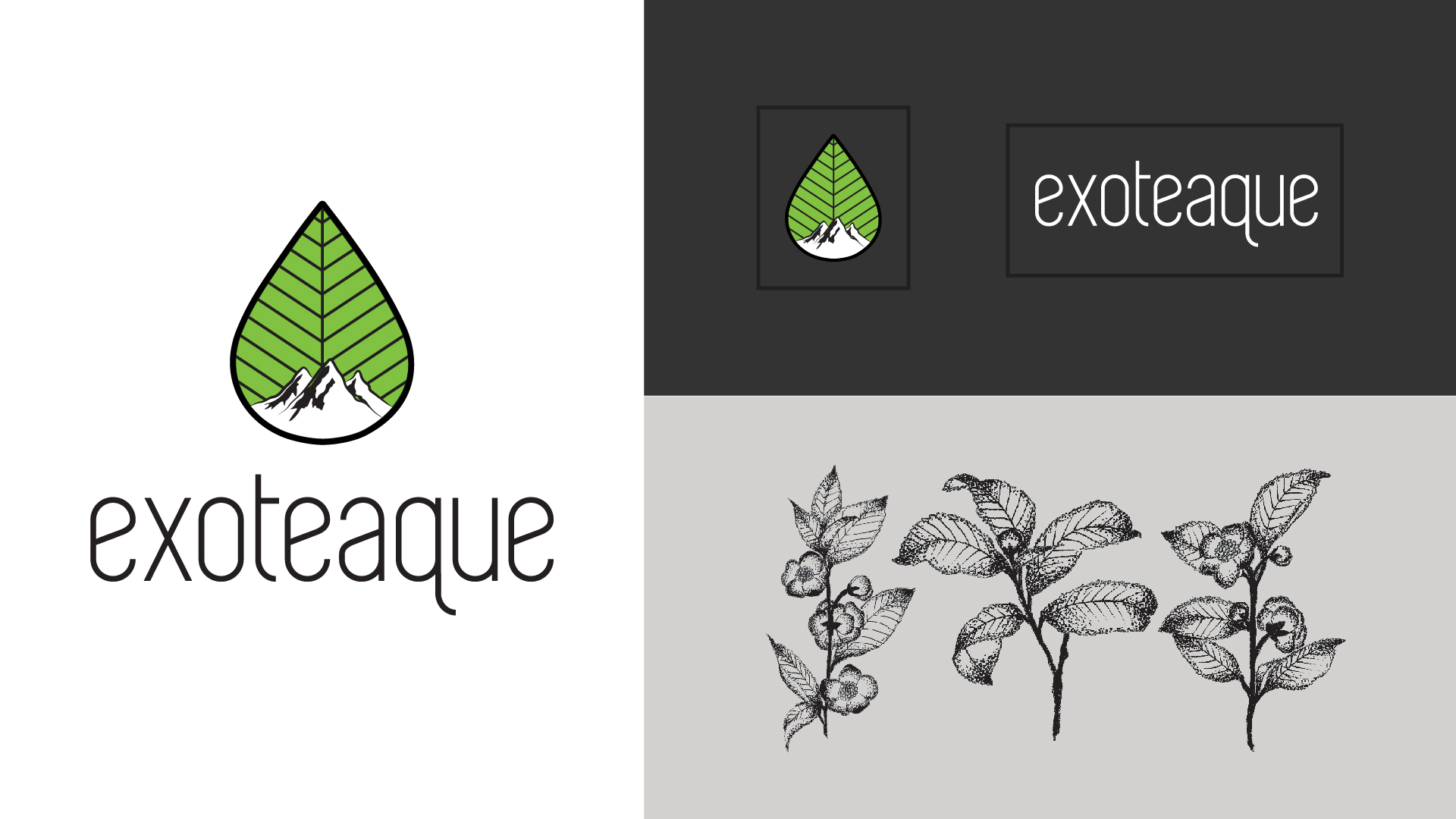
The primary logo pairs a leaf for tea with the Himalayas for its source.
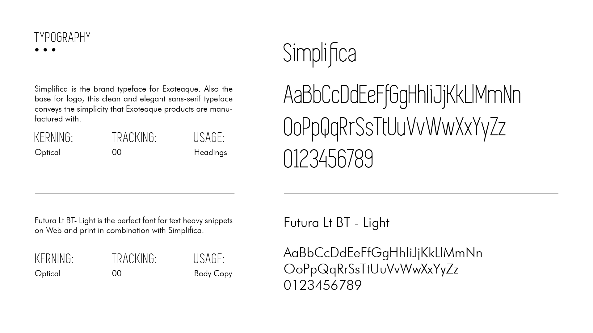
The type is clear and simple to signal quality.
03 pattern
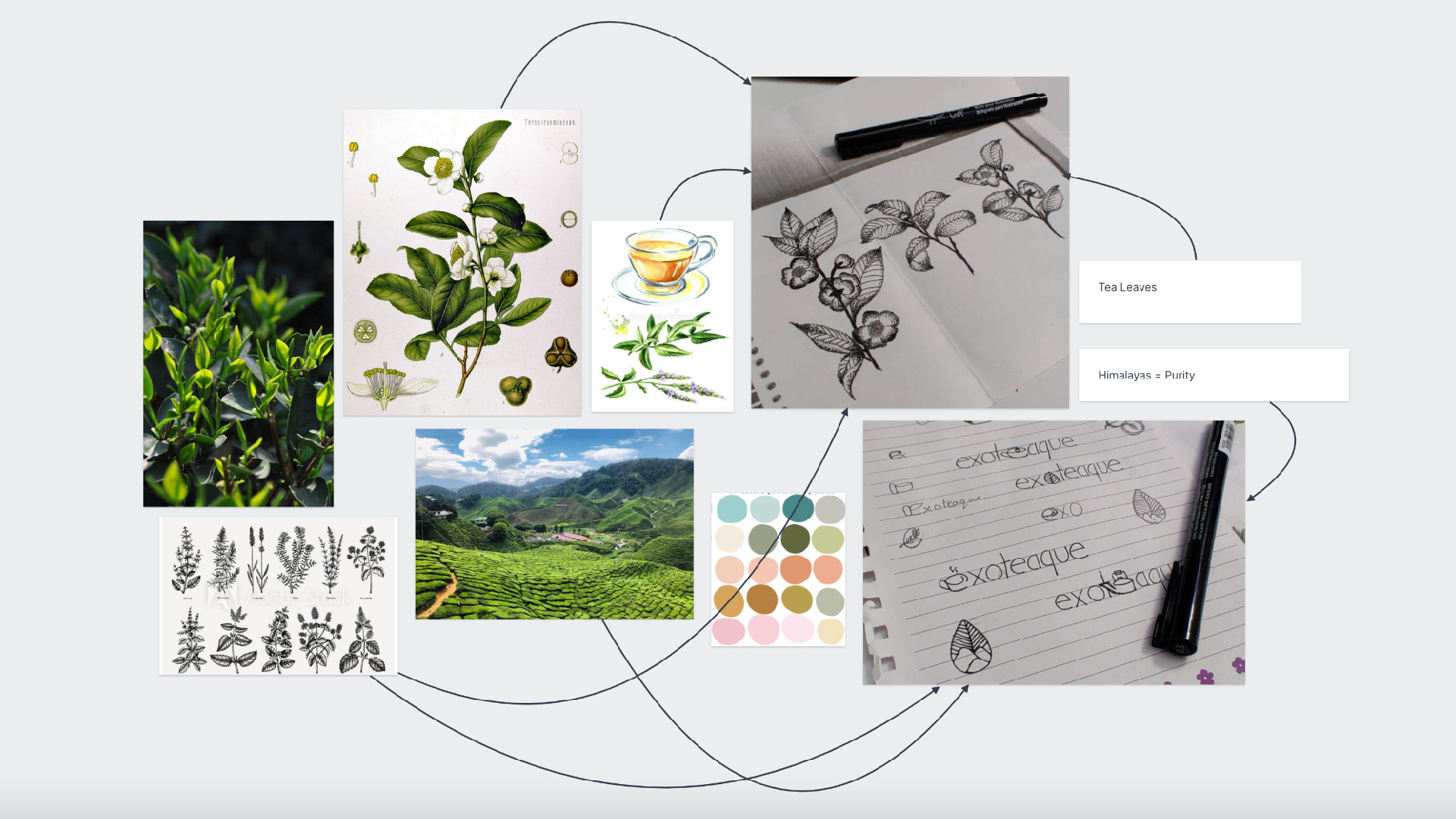
I gathered inspiration from different sources and developed a unique pattern of hand-drawn tea leaf illustrations.
That pattern became the base design for the packaging.
04 outcome
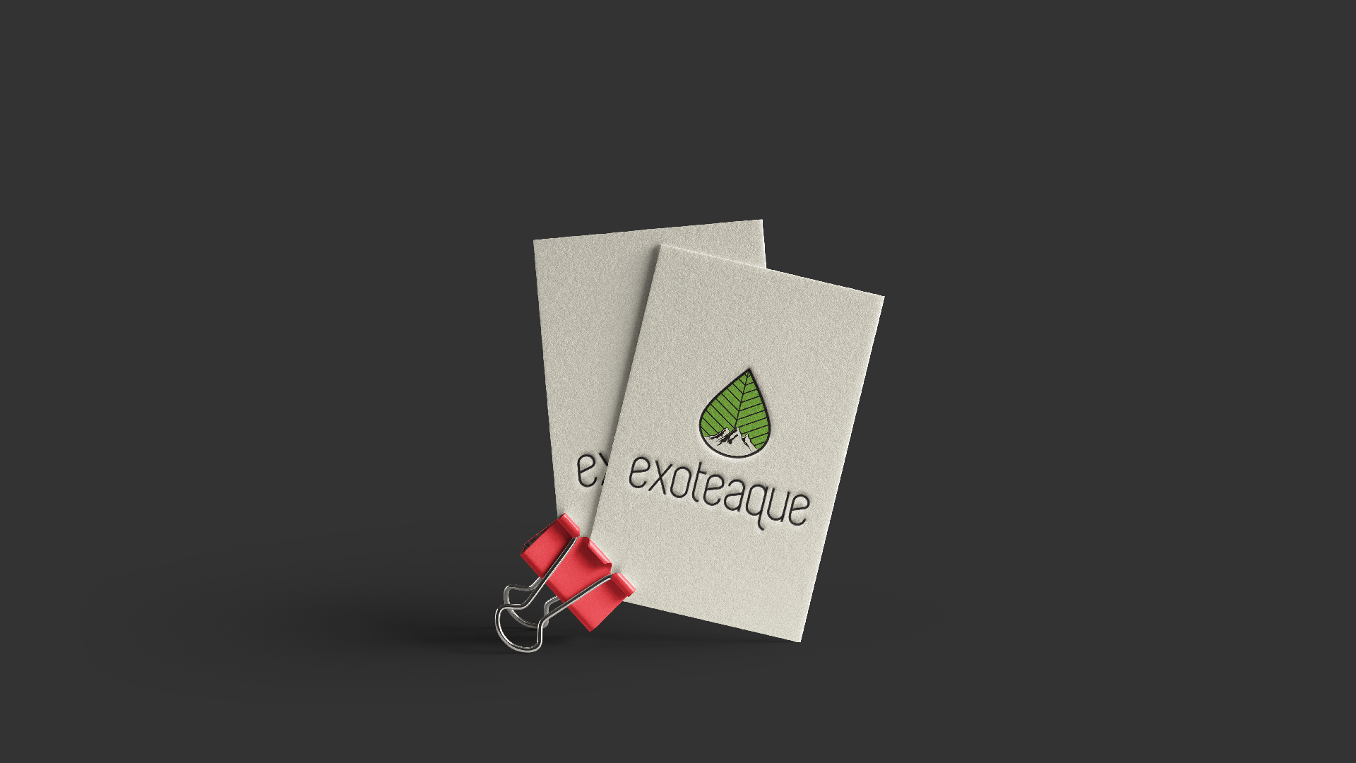
Every piece carries the same leaf and mountain story, from the logo to the pouch.
next case
Toronto, Ontario, Canada
M.A. Graphic DesignB.A. (Hons.) History
© Diljeet Kaur · designed by diljeet kaur