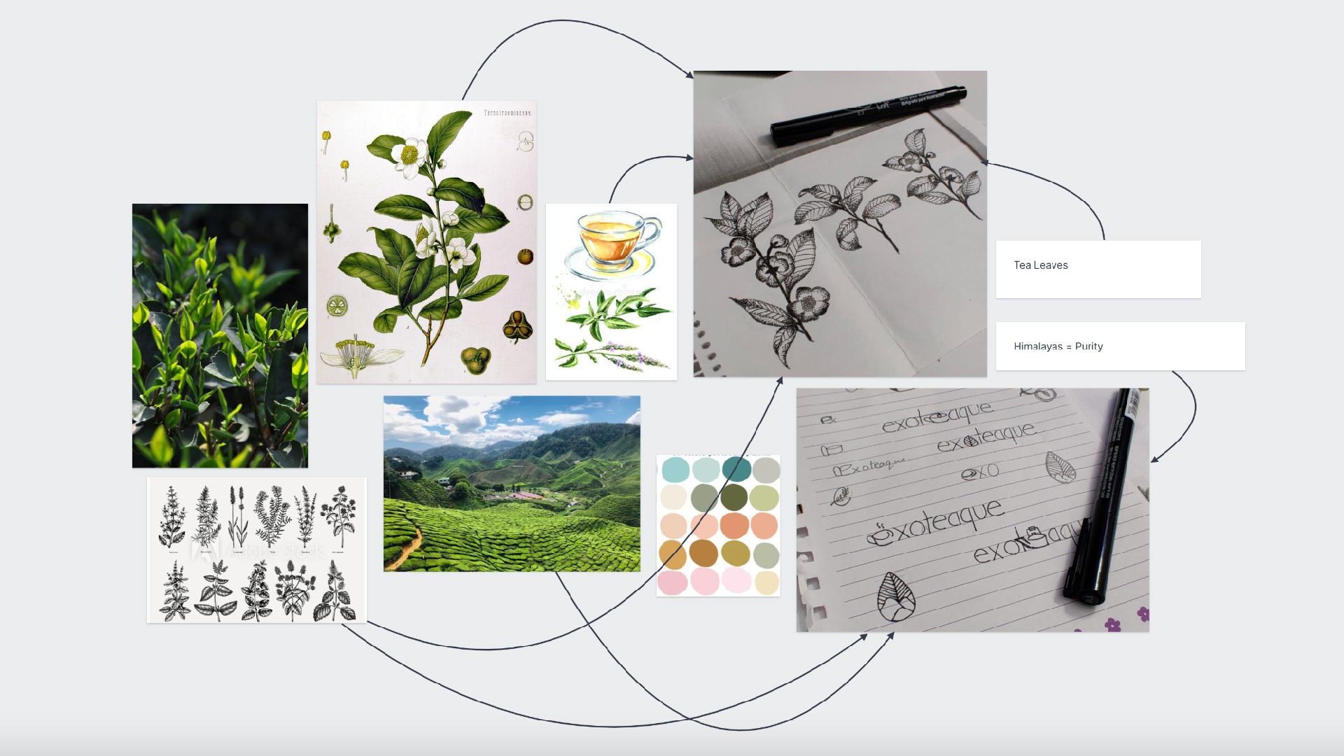
I designed the visual identity for a tea manufacturer with the focus being high quality and purity.
The primary logo consists of a leaf representing tea and the Himalayas representing the source. The font used is clear and simple to represent quality.
Inspiration was taken from different sources and a unique pattern was developed with hand drawn illustrations of tea leaves which was then used as the base design for the packaging.
Exoteaque's goal is to provide fine quality tea and representing that through simplistic design and unique design was important to me.